Welcome to part 2 of our massive How to Evaluate an Online Arbitrage Product to Sell on Amazon.
To assist navigating this article, here is a table of contents for your convenience:
Table of Contents (Part 2)
How to Use Keepa: Predicting Sales Velocity by Analyzing Sales Rank and Price Rank History Using Keepa Chart Trends
First, let's break down a full Keepa chart and explain the different areas. If you have Keepa installed as an extension on your browser, a chart similar to the following will show up when you load an Amazon listing:
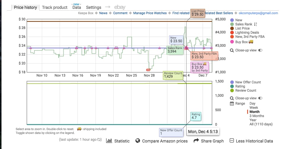
There is a lot going on in the chart above, and it’s all valuable information that helps us make buying decisions.
Top KEEPA Chart – Pricing, Rank, and Buy-Box History
-
The vertical axis on the left represents the product price.
-
The horizontal axis on the bottom represents the date range that the product has been live on Amazon.
-
The vertical axis on the right represents the product rank.
Bottom KEEPA Chart – Offer, Competition, and Review Counts
If you have just installed Keepa, click the “More Historical Data” link in the bottom right corner to open up a second chart that displays offer, competition, and review counts. The right vertical axis represents the count. The offer, competition, and review counts are displayed on the graph via different colored lines.
Keepa Chart Aspects
Notice the navigation column on the far right of both charts. Each colored dot represents a different aspect of this chart, and each aspect is represented on the chart by that same color. You can turn color on and off if you want to view solo aspects. You can also view by time frame from the day or through the entire history of the product. In the example shared above, we are looking at the history of a month. Chart Aspects include:
-
New Price
-
Sales Rank
-
List Price
-
Lightning Deals
-
New, 3rd Party FBA Prices
-
New, 3rd Party FBM Prices
-
Buy Box Price
-
New Offer Count
-
Rating
-
Review Count

Keepa: New Price History – Blue Line
The New Price is represented by the blue line on the top graph. This line displays the marketplace (Third Party Seller) current low offer price for a product in NEW condition. It’s important to remember that the Price History line is based on ALL SELLERS, not just FBA, so it may show the price being way lower than what the FBA and buy box price actually is.
If there is a third party non-FBA merchant seller with a price of $9.00 + $11.00 shipping, the blue line will drop all the way down to $9.00 even though the current buy-box price is actually $23.50 (because Amazon doesn’t usually give the buy-box to merchant sellers w/out free shipping). Example analysis: It looks like the lowest NEW price for the last month has stayed at $23.50, which is extremely stable. In future examples, you’ll notice that that sort of stability isn’t always the case.
Keepa: Sales Rank History – Green Line
In the Current vs. Average Sales Rank section earlier in the guide, we identified how to estimate the velocity of sales based off the sales rank. On the Keepa chart, you can view similar information by analyzing the green line. The lower the green line, the higher velocity of sales. Generally, each time the green line spikes down to a lower rank, it is indicative of at-least one sale. If multiple sales are occurring, the line will stay down low. If it starts to fade up towards a higher rank, it means the product hasn’t sold in a while.
Keepa: List Price – Brown Line
The list price is usually the suggested retail price of a product by the manufacturer or MSRP. This line is usually consistent but sometimes changes if a product has a newer version that is on the market.
Keepa: Lightning Deals – Red Infinity Symbol
Sometimes a red symbol that sorta looks like the infinity symbol will show up on the graph. This represents a Lightning deal, which is a special sale that an Amazon seller hosts for a limited amount of time. Unless you see a bunch of these, this is generally something you can ignore. In this example, someone created a lighting deal around $19.00 in price, and the sales rank graph spiked to an all-time low near 1,000 in rank because of the velocity of sales from the lightning deal.
Keepa: Amazon.com Prices – Orange Shading
Amazon also sells its own products on certain listings. If Amazon is offering a product on a listing, the entire graph will have a shade of orange up to its offer price. The graph above does not have Amazon as a Seller. If Amazon is selling on a listing, it’s tough to resell on the same listing. Amazon almost always wins the buy-boxes.
Keepa: New 3rd Party FBA Prices – Red Triangles
When looking at the graph, the little red triangles represent 3rd Party FBA seller prices. These are sellers using the fulfillment by Amazon service. As an FBA seller, you should mainly only concern yourself with the price of other FBA sellers. The red triangles are the most important price points that you must analyze because it’s the price point that you will be competing with as an FBA seller.
Keepa: New 3rd Party FBM Prices – Blue Triangle
If you see a blue triangle, it represents the 3rd Party fulfilled by Merchant sellers who guarantee 2-day fulfillment, just as Amazon FBA does. These sellers are also your competition, but they are fulfilling directly from their homes or businesses, as opposed to using Amazon FBA warehouses for fulfillment.
Keepa: Buy Box Prices- Pink Diamond
The pink diamonds represent the current price of the offer that owns the buy-box. Many times, the red triangles from the 3rd Party FBA Sellers will overlap the pink diamond for the current buy-box price. This is because the 3rd Party FBA Sellers generally own the buy-boxes because the Amazon algorithm favors them.
Keepa: New Offer Count – Blue Line
The new offer count is represented by a blue line on the bottom graph. This is the number of new offers, or sellers offering the new product, on the listing. In the example above, there is only 1 new offer. There has only been 1 offer for the past month, which means there is only 1 seller offering this new product. The higher number of offers, the higher the amount of competition for the buy-box.
Keepa: Rating – Turquoise Line
The rating line represents the average product rating history on a scale of 1-5. The higher the product rating, the more likely it is to sell.
Keepa: Review Count – Bright Green Line
The bright green line on the bottom chart represents the number of product reviews. The more a product sells, the more reviews it generally receives. If an item has a high number of reviews and a high rating, chances are it is selling really well. The higher the number of recent reviews, the better.
Keepa: Analyzing Sales Rank & Price History Trends through Examples
Let’s take a look at some examples so we can identify how all the individual KEEPA metrics work together to help us analyze leads for the online arbitrage model. Remember, you can estimate sales velocity more accurately by using tools like JungleScout and Unicorn Smasher. The purpose of these examples is to diagnose rank and pricing history and trends so we can solidify good buying decisions and prevent mistakes.
When analyzing sales rank on charts, it’s important to remember that each product has a specific category and that a rank of 50k in one category does not equal the same sales velocity as a rank of 50k in another category. Some categories have a wider variety of high selling products, and therefore higher ranks sell better than other categories with a lower variety.
Keepa Example 1:
The new price, the 3rd Party FBA Price, and the buy box price were all traditionally around $29 until just a few days ago when all 3 spiked to around $32. If you look at the new offer count on the bottom, you can see that the number of sellers offering the product dropped, which indicates that the seller with the lower prices went out of stock, driving the price up to the current $32.
The review count hasn’t increased much over the past 3 months, and the sales rank has been steady around 75k. Most likely, the sellers that went out of stock will come back in stock, and the price will drop back down to the $29 range. If I were analyzing this lead, I would measure it based on a sales price of $29 and not the current $32 price. The amount of sales rank spikes indicates that this product is selling moderately, but certainly not insanely fast.
Keepa Example 2:
This example only shows between 1-3 offers available. The list price is around $25.00, which is exactly what the New 3rd Party FBA and buy-boxes are at also. This means the 3rd Party FBA Seller owns the buy box. The 3rd Party Merchant Sellers are offering a higher price around $30 and they do not own the buy box. The sales rank graph started out slow and has picked up velocity over the past 3 months.
In September it was barely selling at all, as the rank faded all the way up to nearly 850k on October 1st, and then it spiked down under 100k. You might notice that the new offer count also went from 1 to 2 on the same day, meaning a new seller added an offer to the listing. With this new seller's offer, sales drastically picked up. Since the price was around $25 before and after the new seller came onto the listing, the only difference we can pinpoint is that the new seller was a 3rd Party FBA offer, and before it was not.
Once the product was offered through Amazon prime, the rank started to spike and the sales velocity started to increase. With how low this sales rank is stayed, nearly hugging the 0 line, we can tell this product is selling insanely well at a price around $25 from a 3rd Party FBA Seller.
Keepa Example 3:
The new offer count isn’t appearing, which sometimes happens on these graphs, but we can see that there are multiple offers based on the amount of 3rd Party symbols available on the graph. Amazon is selling this item themselves, which is indicated by the orange shading. Again, if Amazon is selling this product, you want to stay away. They usually always win the buy boxes. You can see that Amazon’s price was around $90, dropped to around $75, then slowly went back up all the way $150!
The pink buy-box triangle followed it no matter where they set their price! You can also see that other 3rd party FBA Sellers have set their prices lower than Amazon’s after December 1st, but the buy-box has stayed with Amazon’s price of $150. Also, the velocity of sales peaked around November 23 (Black Friday time), then slowly faded as Amazon almost doubled their price. When prices are spiked, ranks usually slow down. If Amazon is on a listing, it may be best to stay away unless you are familiar with the process of selling against them.
Keepa Example 4:
In this example, the view is expanded to the “all-time” date range. This is a Christmas themed product, and it’s important to point out the trends in the chart. Last year, in November, the rank on this product spiked toward 0 because people were buying it as a decoration for the holidays. Then, after Christmas, the rank slowly started to fade up over 100k for the entire year until November rolled around again. Then, it shot back down toward 0, selling like crazy again before the Holiday season.
It’s also important to point out the giant spike in offers on the bottom chart. Notice that the offer count went from under 10 to over 75 sellers. Because of this, there were 75 sellers competing for 1 buy box, and the price war started. From the beginning of November to mid-December, the price has slowly tanked from around $50 to $25 because of the competitive repricing to try and win the buy-box.
You will see similar trends on long term graphs for seasonal items like sandals and bathing suits (summer items) or winter coats, as well as spikes in sales velocity for other holiday specific items during their particular time of year.
Keepa Example 5:
First, Amazon has been on this listing forever, up until about a week ago, which means it’s safer to stay away from it. However, there are a few notable metrics to point out a few things happening in this graph so you can understand the trend. Amazon has offered this item around $120 traditionally and they held the buy-box the whole time. The average sales rank was holding around 500-1000 which is INSANELY high velocity.
Around Dec 3rd, Amazon went out of stock, which is why the orange shading disappeared. Because of the high velocity of sales on the listing, other 3rd party offers also started selling out, driving the price up to higher offers around $200. The sales rank has faded to around 2500 at these higher offer prices, but it’s still an extremely high sales rank. Amazon will most likely be back in stock soon, but the sellers who won the buy boxes around $200 in Amazon’s absence probably made some pretty good money.
Keepa Example 6:
The massive amount of sales rank spikes means high velocity and action on sales. The list price is around $26, but the New Offer price has been in the range of $15-20. However, notice the buy-box is hugging the 3rd Party FBA offer price which has been fluctuating between $22 and $35. Despite there being lower New Offer prices from 3rd party non-FBA sellers, Amazon is giving the buy box to the sellers who are using their FBA services.
The average sales price for an Amazon FBA seller is around $24, so it’s best to estimate your ROI and profit off of that sales price, as opposed to the recent spikes around $30. The higher price may sustain, but the trend indicates that it will most likely drop back down to the average around $24. There is no orange on this listing, so Amazon is not a seller. Good news!
Here are a few more quick examples for analyzing the sales rank lines only:
Incredibly high velocity of sales and price history. The closer the green line hugs the rank of 0, the better.
Pretty good rank action (around 50k average). Up until June 16th, the pricing was pretty consistent, and then it tanked from about $36 to $30. Notice on this product that the price drop didn’t seem to accelerate the number of sales by much.
Pretty good rank, medium velocity of sales. The wider the sales rank spike ranges, the slower the sales.
Mediocre sales velocity + a recent price tank from $33 to $29. Notice how the sales seem to have picked up slightly after the price dropped. This is a pretty common occurrence.
Terrible rank and velocity. There are only 2 spikes on this entire graph, indicating only a few sales over the life of the product. If you see a graph like this or a graph that doesn’t have a green line or rank at all, stay away.
How to Check Competitor Stock Levels for Amazon Products
When analyzing a product, especially an online arbitrage lead, we mentioned the importance of evaluating the number of sellers on the same listing. If a listing has multiple sellers all rotating in and out of the buy-box, then all these sellers have to share the total velocity of sales.
Sometimes when analyzing a lead, it helps to know how many units a seller has in stock. If there are 5 other sellers who all have a big stock count, it may be harder to get sales once your products arrive. However, if there are 5 sellers who are all only holding a few units each, then you could estimate that they will probably sell out before your units even arrive for sale, and then you would have a pretty good shot of winning the buy box.
There is an awesome tool called AMZScout Stock Stats that allows you to check the quantity of units for each particular seller on a listing with one click accurately. Keepa and AZInsight also have built-in stock checking tools.
How Ratings and Reviews Affect Product Sales on Amazon
In the Keepa charts above, notice the history of ratings and reviews. This is pretty straight forward, but it’s worth mentioning because it can help make or break a purchasing decision. In general, the higher the rating and number of reviews on a listing, the better it is selling. Also, when someone leaves a rating or review, it potentially pushes the product up in Amazon’s rank charts, which in turn can result in more sales. Of course, sales are the most important part of an online arbitrage business, right?
When an item gets a new review, it gets a slight favor in Amazon’s algorithm. A higher favor by Amazon’s algorithm will put it in front of more people when they log onto the website to shop, resulting in a higher chance of sale, and more sales equals a better rank.
Sometimes an item may have a large number of ratings and reviews, but the rank and velocity may be really slow. This could be a product that was popular a few years ago but is no longer selling well. On the other hand, there could be products that have very little ratings and reviews, but the sales rank and velocity show that they are selling extremely well. This could be a new product on the market that people haven’t gotten around to review yet, or it could be a product style that many people buy but never review (think condoms, personal products, etc).
Although the tools above and the Keepa charts are the main reliable sources for predicting sales velocity, it’s also good to analyze the ratings and reviews for extra support.
Quick Online Arbitrage Tip: Look to see how many recent reviews there are. If there are recent reviews, the item is most likely selling. A very small % of people who purchase a product actually leave a review, so if you see a large number of reviews, the amount of purchasers is probably way higher! There are several ways to check ratings and reviews.
Viewing a Product's Reviews Manually on Amazon
If you are on an Amazon product page, underneath the title there is usually a rating and review count:
If you click the blue link, it will open up a page where you can see all the ratings and reviews. By default, it will show you the most popular reviews, but you can also sort by the most recent reviews. Click “See all X customer reviews” and then sort by most recent.
Sort by “most recent”
If you see reviews that are current, then it’s a good sign that the product is selling. If the last review is from a year ago, then chances are the product is a slow velocity item.
How to Analyze Variations to See Which Sizes and Colors are Most Popular
Many of the products that online arbitrage teams sell are in the clothing and shoes categories. Unlike selling a specific item like a toy, many products come offered in various sizes and colors, also known as “variations” in Amazon terms. From a technical perspective, if there are variations of a product, that variation is a ‘child’ of the ‘parent’ product. Therefore, there is 1 parent ASIN, and multiple child ASIN’s underneath the parent ASIN.
When purchasing items with variations for resale, the goal is to purchase the variations that are popular so that we can actually resell them. In clothes, for example, neutral colors like black and grey sell way better than exotic colors like highlighter yellow or fuschia. Instead of buying all of the colors blindly and getting stuck with colors that won’t sell, you can analyze the reviews to see which variations are selling the best. The variations with the most reviews are usually the most popular.
How to Analyze Popular Product Variations Manually for Online Arbitrage
If you are viewing reviews manually, as discussed above, you can also see which “variations” were reviewed the most. Usually, if a certain variation is reviewed more than others, that’s a good sign that it’s more popular than the others. Underneath each review, on the 3rd line down, you can see which variation is being reviewed.
How to Analyze Popular Product Variations with RevSeller for Online Arbitrage
Perhaps the most powerful tool that RevSeller offers is its variation viewer. You can use this tool to quickly view the pricing and variation popularity of all variations in a single window. Before this tool was out, we spent hours selecting each size and color individually and waiting for the new information to load on the page.
It was really hard to tell what variations were popular, and it took forever to check the ROI and Profit potential of each individual variation. Thanks to RevSeller, that painful headache is long gone! If you are on a listing, click the ‘variation viewer’ button that appears if you have RevSeller installed.
In the middle, it shows you a list of all the reviews for each variation. It looks like all the volumes are fairly popular given the sales ranks, but Volume 4 has the most reviews. It’s safe to assume that volume 4 is selling just as well as the other volumes. Because Volume 1 has a much lower sales rank and a good amount of reviews, it is probably selling the best overall. On listings with clothing and shoes, the variations may show up as having the exact same sales rank. In those situations, considering the number of reviews for each variation helps tremendously.
In this example, all variations are sharing a combined rank of 19. The top half of the review list are the colors that are selling the best, all with 7+ reviews or more. In any case, at this rare rank, every color and size is likely selling crazy fast. At the bottom, it breaks down the ASIN, the number of reviews, rank, category, variation name, sale price, and amount of competitive offers for each variation!
This information is crucial, and this is why RevSeller is so valuable. There are listings that have hundreds of variations, and it easily compiles the information so we don’t have to spend time going through and analyzing each one. Make sure you pay close attention to which variations are the most popular, and which ones are selling at good margins.
You can even click on the variation row in RevSeller and it will open up the individual Keepa graph for that variation. Don’t ever assume that all of them are selling good and at high margins just because one color or size is. You’ll end up in the debt chambers.
A few quick tips for purchasing variations for online arbitrage are as follows:
-
Always analyze the metrics of each individual variation
-
Normal sizes sell better (medium and large sell better than small and xl in MOST cases)
-
Neutral colors usually sell better (Blacks, Blues, Greys, Whites and not weird yellows/greens)
-
The less amount of variations on a listing, the higher chance that all variations are selling well.
Analyzing Price History for Variations with Keepa
Up until recently, the Keepa sales rank graphs didn’t work for listings that offered multiple variations. Variations are different sizes, colors, or styles offered for a single product on a single listing page. Luckily, Keepa has now implemented individual data for variations as well. Select which variation you want to view, and you should be able to see a unique chart for each variation.
If you come across a variation that has a poor looking ranking chart, it probably means that size or color isn’t as popular as other sizes or colors. Unfortunately, not all listings have this feature and you will still come across listings where the child variations all carry the parents rank and chart.
If you notice that all the individual Keepa charts are exactly the same for each variation on a listing, you can try to double-check the individual items on CamelCamelCamel. If they still look the same, we’d suggest sticking with buying only the popular sizes and colors from the reviews or your own common sense.
Summary of Price and Rank History Analysis for Online Arbitrage
Now that you know the basics of checking sales velocity and analyzing price history, we are going to transition into estimating ROI and profit potential for your online arbitrage business. The graphs we just covered may feel overwhelming, but you will become an expert at analyzing them over time. The more you look at them, the more you’ll understand the ranking, price, and competition trends. All of the information is vital when analyzing a lead, so spend some time reading and interpreting the charts.
6 Quick Tips to Remember When Evaluating Listings for Sales Rank and Price History for your Online Arbitrage Business
-
Avoid listings that have Amazon as a seller. They usually win the buy box.
-
The lower the sales rank line to 0, the faster the item is selling. Close rapid spikes indicate a high velocity of sales, while really wide spread out spikes indicate slower sales. When the spike dips towards the 0, it means a sale has occurred.
-
Avoid listings with a large number of sellers competing for 1 buy box. Chances are that the price will tank as buyers compete to win the box.
-
Target listings with high product ratings and a high number of recent product reviews.
-
Pay attention to recent price spikes or dips, and analyze the lead based on the averages and not the current outlying trend.
-
Analyzing the 3-month period is helpful, but also remember to look at the price history, the history of buy-box pricing, sales rank history, and more! All of this information is vital in predicting the future trends of the product.
That’s it for the second part of this massive guide. Make sure to read part 3 to complete your education on analyzing OA leads.
Delivered to your inbox every week.
Need-to-know seller content only. No spam. Unsubscribe at any time.
Read The Next Post:
Complete Guide: How to Evaluate an Online Arbitrage Product to Sell on Amazon (Part 3)